
The Vote-Switching Ghost in the Machine Tony Thomas
https://quadrant.org.au/opinion/qed/2020/11/the-vote-switching-ghost-in-the-machine/
“In many Republican strongholds a curious thing happened on election day: while his party received the votes it expected, Donald Trump’s tallies were way down. According to a bipartisan team of computer scientists and data analysts, there is only one explanation: the fix was in.”
It now looks like Deep State criminals have tweaked voting machine software to switch Trump votes – possibly millions of them — to Biden to create the illusion of a Democrat victory. You don’t have to believe me on this. If you still retain a smidgen of high-school algebra, the data patterns in voting in the swing state of Michigan speak for themselves.
A team of three engineers and software analysts have demonstrated that a minimum of 69,000 votes there were switched from Trump to Biden. Biden is supposed to have won Michigan and its 16 Electoral College votes by about 146,000 votes in an electorate of 5.4 million.
If the vote switching occurred, the two candidates would be virtually neck and neck, Trump probably ahead. The same voting machines and their software were used through all the swing states. Another ‘if’: if similar fraud is accepted by courts to have prevailed in those states, the US is headed for a giant constitutional crisis.
The Michigan auditing team was Dr. Shiva Ayyadurai, an MIT trained data scientist and Fulbright Scholar and now Republican Senate candidate; Bennie Smith, a Democrat and software engineer, data analyst and an election commissioner; and Phil Evans, engineer and data analyst. They analysed voting patterns in Michigan’s four biggest counties and concluded the patterns must have resulted from an inserted algorithm that switched salami-slices of votes from the Trump tally to the Biden column. The greater the voting support for Trump and Republicans, the bigger was the slicing-off for Biden. This can be shown by straight trend lines in the graphs, which would normally display a wide scatter.
The prima facie and weird result would be that – absent fraud – the strongest Republican precincts demonstrated the weakest support for Trump. Even if Republicans in general didn’t like Trump compared with the party itself, there is no reason why the strongest Republican districts would be his worst detractors.
The trend line has a peculiar shape of flat followed by a straight slope of about 25 degrees. It prevailed across three counties — Oakland, Macomb and Kent — involving many hundreds of voting precincts each, and it prevailed in the same county when early votes were compared with those on election day. But the clincher for the algorithm’s presence is that in Michigan’s heavily Democrat Wayne County, the conspirators didn’t bother to use it. The resulting pattern among precincts was a limited scatter showing rising support for Trump personally as districts rated as more loyal to Republicanism. This data pattern is nothing like the pattern in the three fiercely-contested counties.
The fraud was easy to implement because, astoundingly, the voting machine software since 2001 has included a “weighted race” feature enabling votes to be skewed to one candidate or another, depending on the software settings. Why this feature was included has never been explained. Moreover, the machines take an image of each vote and these images are what generates the vote tally. Since the election, and contrary to federal law, Michigan officials have been busily deleting the images. This prevents any meaningful audit, other than using the paper votes which is barely practicable. Hence the Ayyadurai team is instead using statistical detective work to highlight the frauds.
In the video below Dr Ayyadurai sets it all out in layperson’s terms. Start watching at 13.30 minutes and you can stop at 50 minutes.
The “fix” can be explained but is better visualised in the charts below. In essence, voters (as in Australia) can vote for individuals, i.e. Donald Trump or Joe Biden, or for their party (Republican and Democrat) in which case their votes are allocated to the individuals. They can’t vote for both. Each precinct’s Republican vote, for Trump or for Party, can be separated for analysis.
A natural result would be for Trump and Party to get about the same vote percentage, regardless of how strongly or weakly Republican a precinct happens to be, whether 30 per cent or 80 per cent. Trump actually has so much charisma among supporters in precincts that he often gets a higher vote than his party.
The fraud analysis turns not on total Trump votes but on the margin favoring him compared to his party. If an algorithm is inserted to switch (individual) Trump votes to Biden, that margin of Trump above Party shrinks. As more Trump votes are switched, the margin fades to zero (50-50) and with even more votes switched, we suddenly find Republican voters are favoring their party above Mr Trump, i.e. his margin goes negative. And when vote switching becomes full-on, it might look as though Trump is being supported by only, say, 25 per cent of the Republican voters in that precinct. How likely is that?
The odd “shape” of the algorithm’s impact on the vote tally cries “fraud” from the rooftops. Where a precinct is heavily Democrat, the conspirators didn’t bother to switch Trump votes so the trend starts at flat. As precincts on the chart are mapped progressively more Republican, the trend abruptly goes on its downward slope, with Republican voters seeming to increasingly favor Party over Trump. That’s thanks to the secret switching. Indeed the inserted algorithm can be reverse engineered to its actual metrics.
This flat-and-then-downward slope occurs in the same precinct or county on different electoral periods, and in different precincts on the same day. To get this strange linear shape even once would be an outlier; to get it naturally over and over, time after time, is beyond reason.
Now here’s the graphed data and trends.
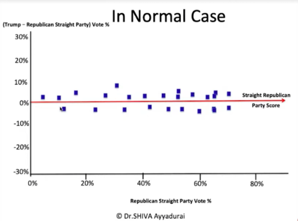 Chart One: The natural (uncorrupted) voting picture: Each blue spot is a voting precinct. Its position on the Y (long) axis represents that precinct’s overall support for Trump, e.g. 20% or 60%. On the X (tall) axis the zero line is Republican voters favoring Trump equally with the Republican Party. If the blue dot is above that zero line, it indicates how much extra support Trump got over his Party. If the blue dot is below the zero line, it indicates that voters rate his Party above Trump, and by how much. Note that the precinct dots just scatter above or below the zero line without trend. No tampering is in this hypothetical example.
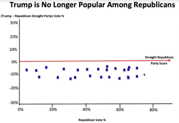 Chart 2: A hypothetical test case – how Chart 1 would look if Trump for some reason was unpopular in his party. He would be voted less than his party, but this wouldn’t vary much whether the party was strong or weak in a given precinct.
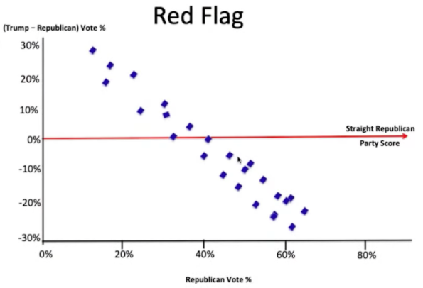 Chart 3: A hypothetical “Red Flag” case for fraud: the natural random pattern has been transferred into a pattern where strongest Republican precincts strangely show the greatest rejection of Trump.
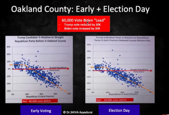 Chart 4: Actual evidence of vote-switching fraud – This chart shows the natural trend of Trump vs his Party being distorted into a weird flat-plus-30deg-slope, on two time periods at the same Oakland County. (The flat initial part is where the algorithm isn’t active). From these dots it can be calculated that the algorithm gave Biden a total 60,000 lead asd a result of 30,000 switched votes.
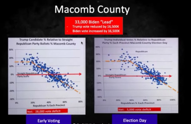 Chart 5: Actual fraud again — the identical pattern at Macomb County, with the conspirators switching 16,500 Trump votes to Biden.
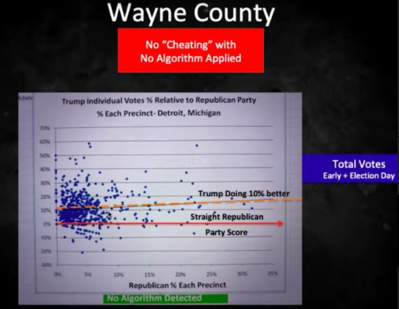 Chart 6: The clincher – Democrat-heavy Wayne County, where conspirators didn’t bother to apply their algorithm. The story here is that even though Republican support was low, Republican voters heavily backed Trump compared with his party (dots clustering above the line in the 0-20% region of Republican support). And with no conspiratorial tampering, Trump support over party actually rose in precincts with greater overall Republican support, contrary to the “fix-is-in” graphs 4 and 5.
This is all just the first fruits of the election fraud investigations. USA politics have indeed moved into uncharted territory.
Tony Thomas’s new book, Come To Think Of It – essays to tickle the brain, is available here as a book ($34.95) or an e-book ($14.95)
Comments are closed.